Experiment Configuration and Analysis
The Experiments section in GrowthBook is all about analyzing raw experiment results in a data source.
Before analyzing results, you need to actually run the experiment. This can be done in several ways:
- Feature Flags (most common)
- Running an inline experiment directly with our SDKs
- Our Visual Editor (beta)
- Your own custom variation assignment / bucketing system
When you go to add an experiment in GrowthBook, it will first look in your data source for any new experiment ids and prompt you to import them. If none are found, you can enter the experiment settings yourself.
Adding an Experiment
You can add an experiment analysis to GrowthBook in a few ways.
Starting an Experiment Analysis from a Feature
This is the easiest way to start a new analysis if you have a Feature set up. Navigate to the Feature of interest and click "View results" in the Experiment Rule of the Feature. Read more about running feature experiments here.
Importing an Experiment Analysis from your Data Source
You can also import an analysis directly from your Data Source using your configured Experiment Assignment Source. If you navigate to the Experiment page in the left toolbar and click Add Experiment, you'll see the following panel.
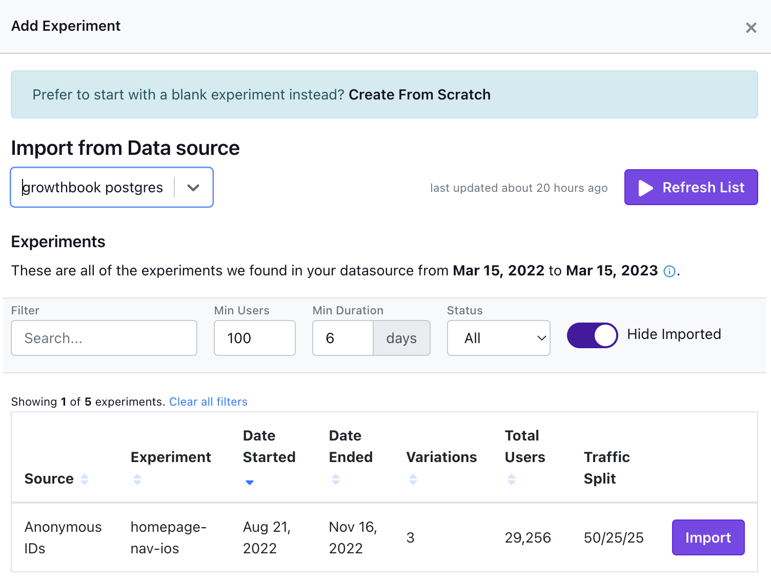
On this modal you can either create an experiment using some metadata that we infer from your metric source using the Import buttons on the right hand side. You can also manually create an experiment from scratch.
Experiment Configuration
There are several different ways to configure your experiment analysis.
Experiment Metadata
The top left of the experiment page shows the experiment name, tags description, hypothesis, and variation metadata. You can edit these fields as you see fit to help describe and categorize your experiment.
Experiment Settings
Here is where much of your experiment analysis is configured. Many of the fields here have some text explaining how they affect your analysis. Here are a few of them in more detail:
Experiment Id - This is the key that will be used when filtering your experiment assignment source to query experiment exposure data.
Activation Metric - A binomial metric that will filter the users in your analysis to only those who have converted on this binomial metric. This should only be used if activation is expected to be independent of experiment assignment. If an experiment affects the activation metric directly, then there is the potential for bias in your analysis.
Metric Conversion Windows - Each user has a conversion window defined by when they were exposed to the experiment. If a user was recently exposed to the experiment, or was exposed near the end of the experiment, they may not have had the full window to convert before the analysis window closes. You may exclude these users with "In-Progress Conversions" if you want your experiment averages to only include those who have had the full window to convert.
Attribution Model
Attribution models deal with how we attribute metric values (conversions, counts, any arbitrary value to be aggregated at the unit level) to individual units (e.g. users). They rely on the concept of "conversion windows" which is discussed more in depth on the Metric documentation page.
There are 2 Attribution Models that experiments can use:
- First Exposure uses a single conversion window based on the first time the user sees a particular experiment. The conversion window runs from the exposure timestamp + the conversion delay hours and for however many hours the conversion window is set to. For example, if the delay is 12 hours, and the window is 24 hours, then we will aggregate the metric values for each user from 12-36 hours after their first experiment exposure.
- Experiment Duration uses a single conversion window that extends from their first exposure + conversion delay until the end of the experiment or phase. For example, if the delay is 12 hours, then the conversion window will extend from 12 hours after each user is bucketed until the present time or the end of the experiment/phase, if specified.
This table summarizes the two models:
| Attribution Model | Conversion Window Start | Conversion Window End |
|---|---|---|
| First Exposure | First Exposure Date + Conversion Delay | Conversion Window Start + Conversion Window Length |
| Experiment Duration | First Exposure Date + Conversion Delay | End of Experiment |
Currently, all analyses will use the "First Exposure" model by default. The Experiment Duration model replaced the All Exposures model in early 2023.
Experiment Metrics
You can add metrics as goal metrics, guardrail metrics, or both. You also can add "Metric Overrides" which provide experiment-specific controls for metrics, allowing you to override the metric's defaults for, for example, conversion windows and risk thresholds.
Experiment Phases
Experiment Phases can help you filter the dates used in the experiment analysis. Be very careful using phases. If you move the start date of the phase to past the start date of the experiment (and users were not re-randomized across phases), then your analysis could suffer from carryover bias. It is best to always look at the full history of an experiment if possible.
Making Changes While Running
We allow you make changes to an experiment's targeting while it is running. This is especially useful if you want to start running on a small percent of traffic and then gradually ramp up exposure.
Based on what you are changing, there are two recommended ways to release these changes. The UI should guide you to make the correct recommended choice in most cases, but you are able to change this if desired.
Update the existing phase
This modifies the experiment in-place without resetting results or re-randomizing users. This provides the best user experience for your users and you can re-use data that was already collected, which can reduce the time the experiment needs to run.
However, if you're not careful, this can introduce significant bias and data quality issues into your results. A few categories of changes are broadly considered "safe" and if you are only making these changes, this is the approach we recommend going with. The "safe" changes are:
- Increasing the percent of people included in the experiment
- Removing a condition from an experiment (e.g. going from "US visitors only" to "All visitors")
- Removing an experiment from a namespace
All of these changes have something in common - they are simply increasing the number of users exposed to the experiment. There is no affect on existing users in the experiment.
Start a new phase
This creates a brand new phase of the experiment. All data collected until this point is excluded from the analysis and you start fresh (nothing is deleted from your data warehouse, we just hide old data from the results).
In addition, there is a recommended toggle to re-randomize traffic. This will cause everyone - including existing experiment users - to get assigned a new random variation. This can be a disruptive user experience since many people will switch from Control to Treatment (or vice versa).
Why would you ever want to do this? Some changes you make completely invalidate past results so this lets you cleanly separate the data analysis from before and after you make the change. Re-randomizing traffic can also eliminate carryover bias and make your results more reliable and accurate.
We recommend this approach for any change that is not considered "safe" (listed above). This can include (but not limited to):
- Changing the traffic split between variations
- Adding a new targeting condition
- Decreasing the percent of people included
Because of how disruptive this can be, it's best to plan ahead before starting an experiment. It's better to start with more conservative targeting and scale up than the reverse (starting big and scaling back).
Experiment Results Table (Bayesian Engine)
Once imported or added, go to the Results tab to view and update the results:
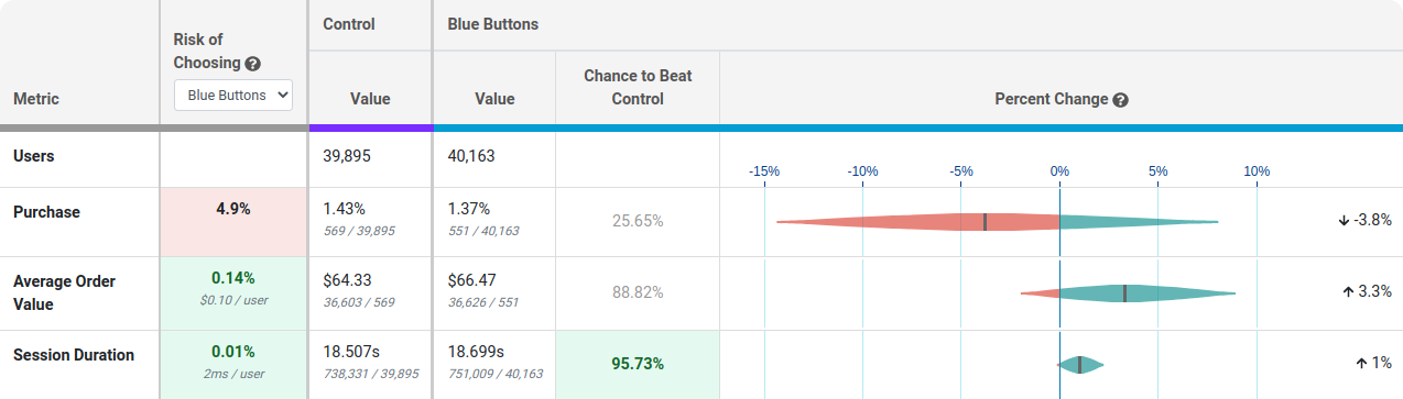
Each row of this table is a different metric.
Risk tells you how much you are predicted to lose if you choose the selected variation as the winner and you are wrong. Anything below 0.25% is highlighted green indicating the risk is very low and it's safe to call the experiment. You can use the dropdown to see the risk of choosing a different winner.
Value is the conversion rate or average value per user. In small print you can see the raw numbers used to calculate this.
Chance to Beat Control tells you the probability that the variation is better. Anything above 95% is highlighted green indicating a very clear winner. Anything below 5% is highlighted red, indicating a very clear loser. Anything in between is grayed out indicating it's inconclusive. If that's the case, there's either no measurable difference or you haven't gathered enough data yet.
Percent Change shows how much better/worse the variation is compared to the control. It is a probability density graph and the thicker the area, the more likely the true percent change will be there. As you collect more data, the tails of the graphs will shorten, indicating more certainty around the estimates.
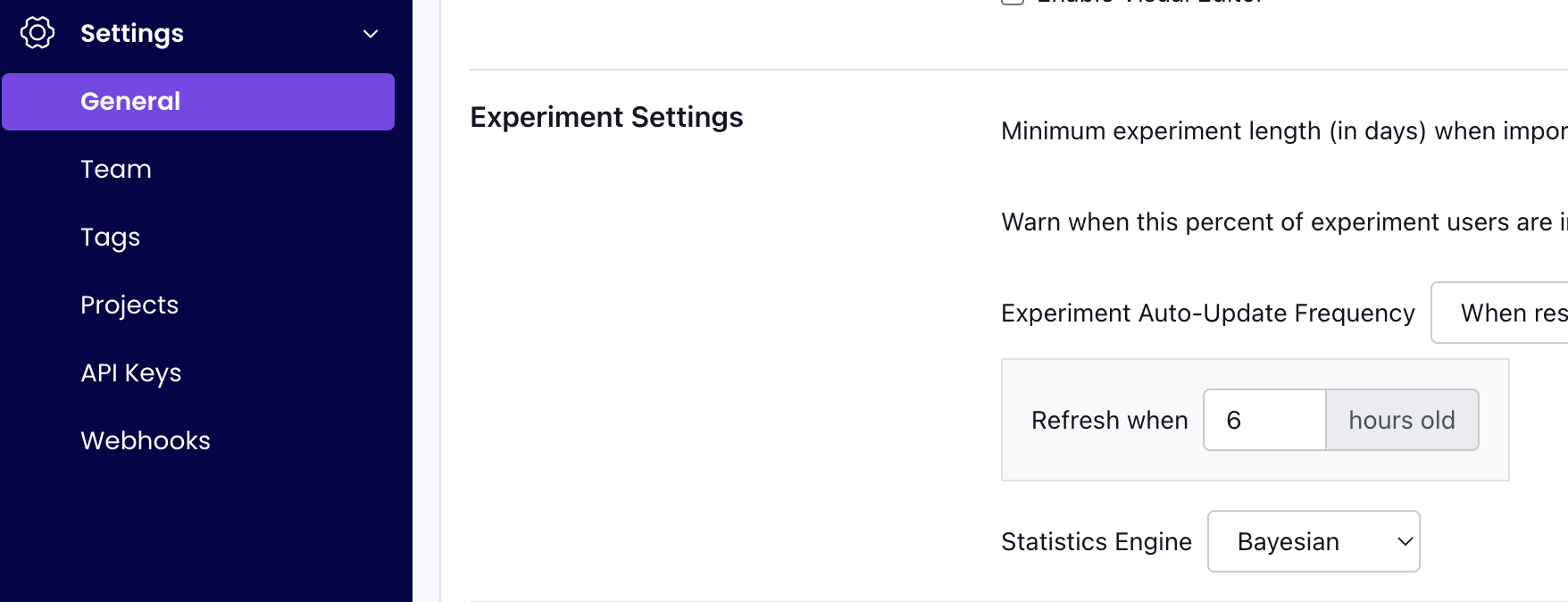
Experiment Results Table (Frequentist Engine)
You can also choose to analyze results using a Frequentist engine that conducts simple t-tests for differences in means and displays the commensurate p-values and confidence intervals. You can switch to the frequentist engine under General -> Settings -> Experiment Settings -> Statistics Engine.
If you select the "Frequentist" engine, when you navigate to the results tab to view and update the results, you will see the following results table:
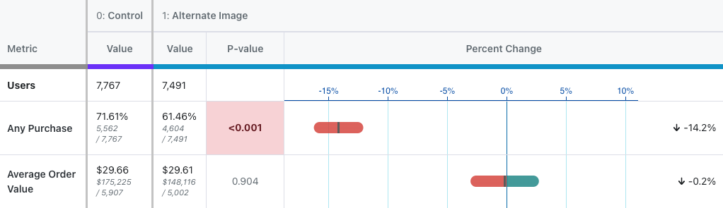
Everything is the same as above except for three key changes:
- There is no longer a risk column, as the concept is not easily replicated in frequentist statistics.
- The Chance to Beat Control column has been replaced with the P-value column. The p-value is the probability that the percent change for a variant would have been observed if the true percent change were zero. When the p-value is less than 0.05 and the percent change is in the preferred direction, we highlight the cell green, indicating it is a clear winner. When the p-value is less than 0.05 and the percent change is opposite the preferred diection, we highlight the cell red, indicating the variant is a clear loser on this metric.
- We now present a 95% confidence interval rather than a posterior probability density plot.
Sample Ratio Mismatch (SRM)
Every experiment automatically checks for a Sample Ratio Mismatch and will warn you if found. This happens when you expect a certain traffic split (e.g. 50/50) but you see something significantly different (e.g. 46/54). We only show this warning if the p-value is less than 0.001, which means it's extremely unlikely to occur by chance.

Like the warning says, you shouldn't trust the results since they are likely misleading. Instead, find and fix the source of the bug and restart the experiment.
Guardrails
Guardrail metrics are ones that you want to keep an eye on, but aren't trying to specifically improve with your experiment. For example, if you are trying to improve page load times, you may add revenue as a guardrail since you don't want to inadvertantly harm it.
Guardrail results show up beneath the main table of metrics and you can click on one to expand it and show more info. They are colored based on "Chance of Being Worse", which is just the complement of "Chance to Beat Control". If there are more than 2 variations, the max value is used to determine the overall color. A "Chance of Being Worse" less than 65% is green and of no concern. Between 65% and 90% is yellow and should be watched as more data comes in. Above 90% is red and you may consider stopping the experiment. If we don't have enough data to accurately predict the "Chance of Being Worse", we will color the metric grey.
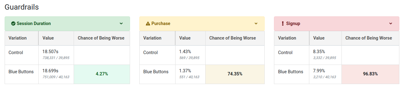
If you select the frequentist engine, we instead use yellow to represent a metric moving in the wrong direction at all (regardless of statistical significance), red to represent a metric moving in the wrong direction with a two-sided t-test p-value below 0.05, and green to represent a metric moving in the right direction with a p-value below 0.05. Otherwise the cell is unshaded if the metric is moving in the right direction but not statistically significant at the 0.05 level.
Dimensions
User or Experiment
If you have defined dimensions for your data source, you can use the Dimension dropdown to drill down into your results. For SQL integrations (e.g. non-MixPanel) GrowthBook enforces one dimension per user to prevent statistical bias and to simplify analyses. For more on how GrowthBook picks a dimension when more than one are present for a user, see the Dimensions documentation. This is very useful for debugging (e.g. if Safari is down, but the other browsers are fine, you may have an implementation bug) or for better understanding your experiment effects.
Be careful. The more metrics and dimensions you look at, the more likely you are to see a false positive. If you find something that looks surprising, it's often worth a dedicated follow-up experiment to verify that it's real.
Date
The date dimension shows a time series of the count of users first exposed to an experiment, as well as effects when comparing users first bucketed on each day.
Take the following results, for example.
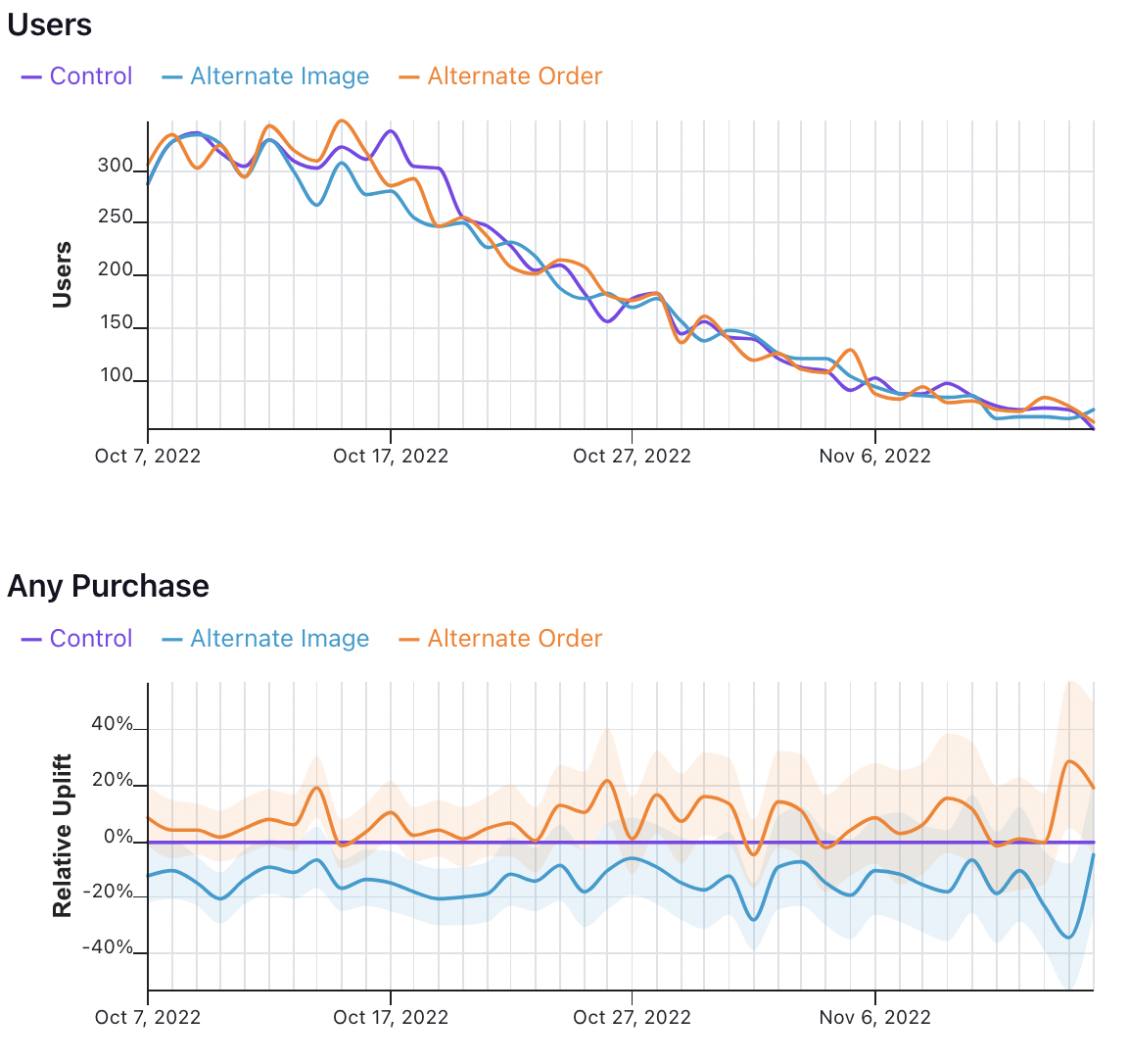
In the first graph, we see the number of users who were first exposed to the experiment on that day.
In the second graph, we see the uplift for the two variations relative to the control for all users first bucketed on that day. That means that the values on October 7 show that users first exposed to the experiment on October 7 had X% uplift relative to control, when pooling all of the data in their relevant conversion window. It does not mean show the difference in conversions across variations on October 7 for all previously bucketed users.
That analysis, and other time series analyses, are on GrowthBook's roadmap.